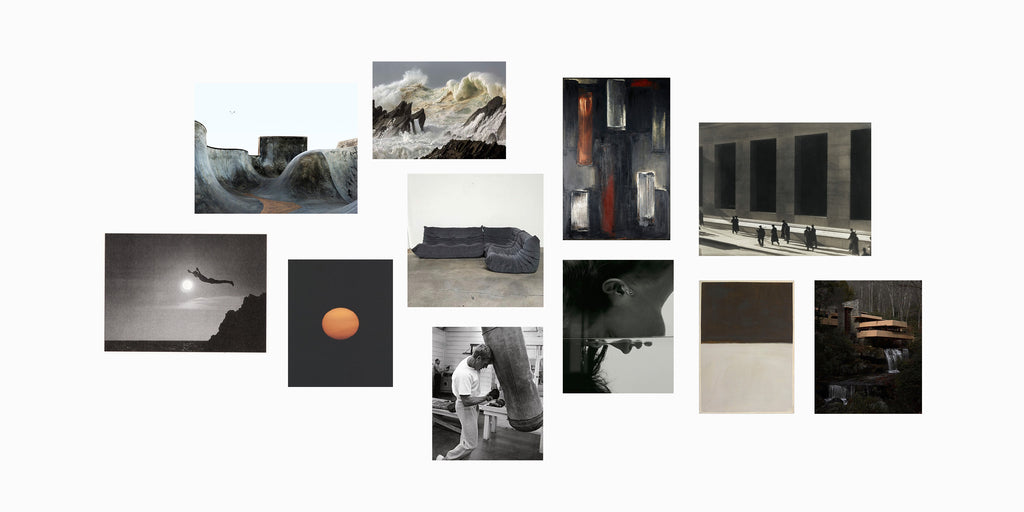
“Genius and virtue are to be more often found clothed in gray than in peacock bright.” — Van Wyck Brooks
Gray is a neutral favorite for a reason. Neutral colors are most clearly defined as hues that appear to be without color, and that don’t typically appear on the color wheel. Neutral colors, therefore, do not compete with primary and secondary colors and instead compliment them. Grey has its own color wheel. Within the color grey lies innumerable variations of color, all with a strong point of view. All grays, in general, are associated with being timeless, methodical, balanced, and emotionless. They represent responsibility, fairness, loyalty, wisdom, selflessness. When discussing grey, the conversation must involve tone.
Tone : the effect in painting of light and shade together with color
Tones are created when gray is added to a hue. This makes the hue look softer or more dull than before. Grey is the existence of both light and shade. Chromatic Grey is to see a descriptive name in conjunction with the word gray to help distinguish the color’s hue family, e.g. blue-gray or green-gray.

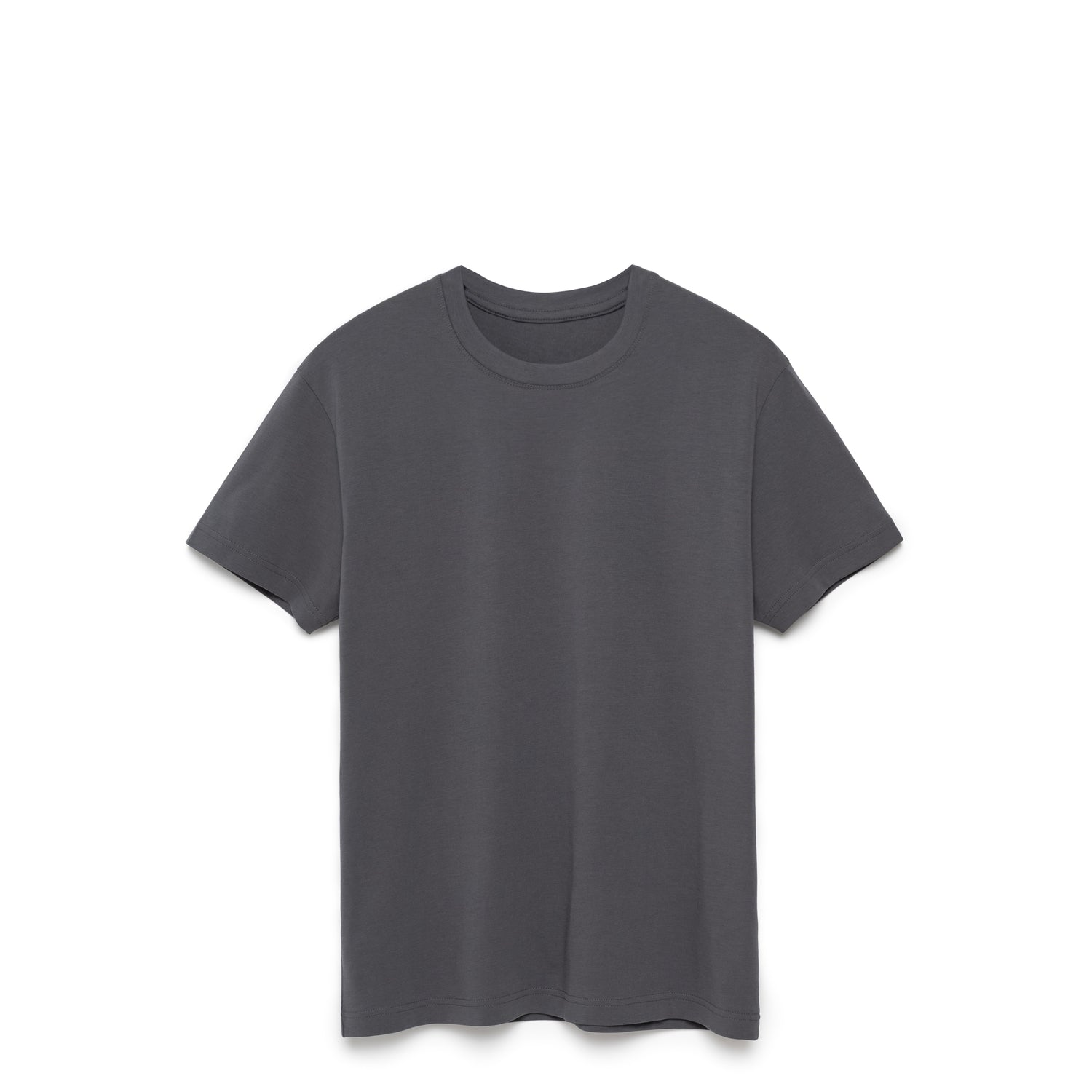
We designed with the color slate because of its opulence, strength, and grounded nature. While it is gray in theory, it stands alone as a unique color. You’re more likely to see the color gray as a secondary color, playing a supporting role to some other, stronger, character. Our interpretation of slate is the stronger character.
Slate (of the metamorphic rock form) is mainly composed of quartz and muscovite (think Mica) found in clay or volcanic ash. Slate is frequently grey in color, especially when seen en masse and occurs in a variety of colors depending on the composition and locality. A mixture of black (death) and white (peace); ashes and dust.
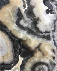
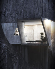
Slate enhances the variation in other colors by creating subtle visual interest that both diminishes the vibrancy of the individual color and yet highlights the colors focal points. Most people are attracted to saturated colors. Slate, a saturated grey, makes all of our colors look brighter, vibrant, and chromatic.



Leave a comment
This site is protected by hCaptcha and the hCaptcha Privacy Policy and Terms of Service apply.